29 December 2016

Equipment Test: Earth Resistance

Earth Resistance Meters – A Review

Introduction

The twin-probe earth resistance meter, being relatively cheap, is often the first piece of geophysics equipment purchased by local archaeological societies. While it may not be the first port of call if you have access to a magnetometer or GPR, there are many situations where it is superior. I've found that earth resistance is the most reliable method for finding Roman roads. Recently, I've had access to multiple pieces of equipment, so I have decided to do a review.

The first of the three machines is the Geoscan RM15. Now replaced by the RM85, which unfortunately I don't have access to, the only major differences that I'm aware of is the inclusion of the multiplexer within the box rather than as an add-on, GPS logging and output via USB instead of the old serial port. If there are further changes that would change this review, I apologise to Geoscan now.

The second machine is the TR Systems meter, which was aimed at local societies and proved very popular before production ceased. Though it is not available any more, its use is so widespread that I include it here for comparison purposes, as many will be familiar with it.

The third machine is the Frobisher TAR-3, a relative newcomer, and like the TR Systems meter, affordable by local societies on a budget.


User Interface

The best way to introduce this section is with images of the interfaces of each machine.
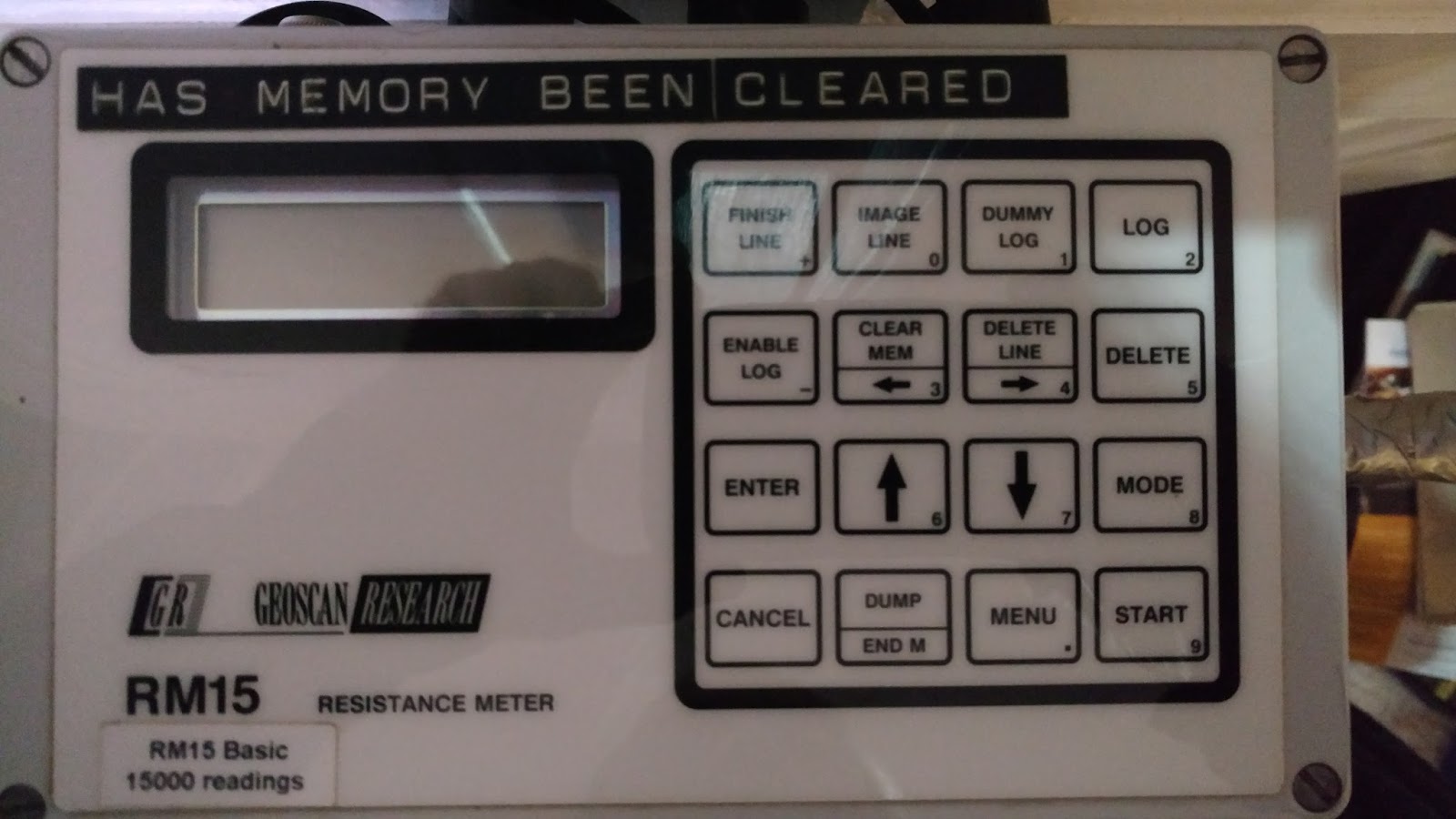

Geoscan RM15 Interface


TR Systems Interface
 
 
Frobisher TAR-3 Interface

Both the RM15 and TR machines have a similar interface style, with buttons for each function. The TR machine seems to have taken a design lead from the Geoscan machine, no doubt hoping that familiarity will translate into ease of use. The Frobisher machine has a more minimalist style, with 5 buttons (duplicated, for left handers) controlling a menu system, similar to that used by Bartington in their GRAD601. Ease of use is subjective, and somewhat reliant on familiarity, but some comments can be made.

The Geoscan machine is probably the easiest to use. The TR Systems meter works in much the same way, but has an annoying feature where instead of beeping once when a reading is taken, it will beep when it is starting to take the reading and beep a second time when it is finished. If you take the probes out too early, before the second beep, it will complain furiously, saying something about checking the probes, when you know it is because you took the probes out too early, and you have to wait several seconds before it will allow you to continue. I gather that this 'feature' is due to listening to feedback from users who really should not have been listened to. The Frobisher, lacking the dedicated buttons for each function, is probably the least intuitive, and you will probably need the manual at hand the first few times you use it, until you get used to it. Training is available though. There are inconsistencies with the beeps to record a reading, so at the end of line beep, there is a pause and a further beep which may incorrectly suggest that another reading hasn't been taken, and when you are retaking a reading, there is no beep to say it has been taken. The other strange design decision relates to the end of the grid. It will take 20 seconds to write out the readings to its storage, and then turn itself off, cancelling out the speed increase afforded by the ergonomic design. Hopefully some of these issues will be resolved with firmware updates.

Verdict: 1st – Geoscan, 2nd – TR Systems, 3rd - Frobisher


Ergonomics

A big part of the 'experience' of doing an earth resistance survey is lugging the machine around the survey area, over and over again, so how your equipment handles is of great importance. A common criticism of equipment like this is the effect it has on someone with a bad back, both because of the weight of the equipment, and because the height of the bar which you hold on to can make you stoop somewhat. With that in mind, here is a table with some statistics on the three machines.

Machine
Weight (sans cables)
Bar Height
Geoscan RM15
5.1Kg
93cm
TR Systems
4.4Kg
93cm
Frobisher TAR-3
2.8Kg
105cm

As you can see, the Frobisher is much lighter and has a higher bar than the other two. My volunteer, Stuart, who has a history of back problems, reported that the Frobisher was his favourite. Another beneficial side effect of a ligher machine is the ability to move it quicker, meaning the survey area is covered quicker. Frobisher can supply whatever bar height required on ordering, including a childrens size frame (40cm-130cm).

Verdict: 1st - Frobisher, 2nd – TR Systems, 3rd – Geoscan


Hardware Options

The biggest selling point of the Geoscan RM85 has a built-in multiplexer, which used to be a separate add-on to the RM15, so parallel and deeper readings can be taken at the same time using the adjustable probe frame (an additional option). The RM85 also has an option of GPS recording if you are into using point clouds.

The TR systems meter had an optional tomography kit for doing manual ERT surveys and producing pseudosections using the free version of RES3DINV.

The Frobisher machine, being new, has yet to accumulate the same level of hardware options as the other machines, but one very useful feature is that the fixed probe cable is easily extendable, meaning more grids can be surveyed without moving the fixed probes. The manufacturer has mentioned that the cable could potentially be done away with entirely, with an entirely separate transmitter, which means very large areas could be done without moving the fixed probes, so faster surveys and no edge matching in software required. A wenner bar is available, and a tomography kit is in production.

Verdict: It really depends what you find useful!


Battery

While I can't compare battery life for each machine, I can comment on how easy it is to change batteries.

The Geoscan RM15 and RM85 have an internal battery pack of standard batteries (normal or rechargable). The unit needs to be unscrewed to replace the batteries, but it is possible to do this in the field.

The TR Systems meter has two plastic trays that slot into the side of the machine, so batteries (9V, standard or rechargable) can be easily changed in the field.

The Frobisher TAR-3 has an internal rechargable battery pack that is not user accessible. If something goes wrong with the battery, the unit must be returned to the manufacturer. It is charged via a USB connector, so can be charged in the field using a car charger, or anything that could charge a phone.

Verdict: 1st – TR Systems, 2nd – Geoscan, 3rd - Frobisher


Downloading Data

The RM15 and TR systems meter download via an old 9 pin serial connector, so you would need a serial to USB converter or card to download the data. Fortunately, the replacement for the RM15, the RM85, has now been changed to a USB connector that mimics a serial port, no additional hardware needed. The Frobisher TAR-3 stores data on an SD card that can be read with any card reader, so getting the data onto your computer is much faster.

Verdict: 1st – Frobisher, 2nd – Geoscan, 3rd – TR Systems


Data Quality

The test site was a park through which ran a Roman road. The park is surrounded by buildings, which was an opportunity to see how the three machines were affected by AC interference. The same fixed probe location (0.5m apart) was used for each of the three surveys. The area had been previously surveyed using GPR, and the road is visible in the timeslices starting at about 30cm down, along with some land drains or utilities. The surface is known to be made of flint, and the local geology is on the boundary between Folkestone Formation sandstone and Lower Greensand.


The GPR grid shown above is 30x30m, and the earth resistance test grid occupies the top-left 20x20m of that area. The results, shown below were processed in Snuffler with no filters applied. The display bounds were set to 95% of the readings around the median. There isn't much evidence of noise on any of the three images, and they seem broadly consistent with eachother.

Geoscan RM15
 
TR Systems

Frobisher TAR-3

Verdict: Not much to choose between them, make up your own mind!


Price

When I bought my TR systems meter, many years ago, the price was £1200. Inflation would make that about £1800. At the time of writing, the Frobisher TAR-3 is £1844 (including a days training), not very different from the TR Systems meter, and aimed at the same budget conscious market. I'm not absolutely sure of the price of the currently Geoscan RM85, but I have been told the basic machine £5000, with the multi-probe array another £1500.

Verdict: Joint 1st – TR systems, Frobisher, 3rd – Geoscan


Conclusion

Given that the TR Systems meter is not currently available, that leaves us with the Geoscan and Frobisher machines. If you want the multiplexer option, then get the RM85, otherwise the lower cost and lighter Frobisher machine will save your back and bank balance.


29 October 2016

Latest Results: Chichester

Following on from last year's very successful radar survey in Chichester, I went back for another week of the same, this time around the area of the Cathedral in the south-west quadrant of the city. Chichester & District Archaeological Society had already found a lot in the area using earth resistance and excavation, so the radar didn't show a lot that was new, just in slightly better definition. There wasn't a lot around the cathedral itself, so the area has probably had any Roman remains there thoroughly removed, but there was around the Deanery and Bishop's Palace. The garden of the Deanery contains the old medieval (or post-medieval) Deanery, and the the area in front of the Bishop's Palace contains a Roman building and the medieval hall that was the old Bishop's palace.

The old Deanery in the garden of the current Deanery
Click for larger image

Roman building (green) and medieval Bishop's Palace (orange)
Click for larger image

I also went back to Priory Park to look again at the third Roman building (in green, within the lighter survey area) found near the cricket pitch. It has suffered greatly from robbing, not least by the Saxons, who seem to have used some of the stone in their sunken floor buildings, two of which appear (in purple) in the higher resolution re-survey of this area.

Priory Park survey. Click for larger image.

I'll be giving a talk on the results from both years for CDAS on the 22nd of February 2017 at 7:30pm in the cinema of the New Park Centre, New Park Road, Chichester.


04 October 2016

More on Processing UK Environment Agency LIDAR Data

Since I found that my last blog post on displaying Environment Agency LIDAR DEMs has become the most ever viewed blog post that I have written (popular subject apparently), I've been thinking of writing a followup, having learned a few new things. One of the main problems with dealing with all this LIDAR data is speed. First, getting the data to a state that is useful takes a lot of processing, which can be solved by automating the process using some python scripts I wrote. Second, the draw speed on the screen in QGIS can be solved using Virtual Raster Tables and Pyramids. This tutorial will assume that you are using the OSGeo4W package on windows, with QGIS, python  and OSGeo4W Shell options installed, but much of it may be transferable to other setups.

I'll start by throwing some python code at you for processing the data, and then explain a bit about what it does and how to run it. Put this code in a file somewhere called demimport.py


#!/usr/bin/env python

import sys
import zipfile
import os

impdir='e:\\data\\gis\\dem\\import'
expdir='e:\\data\\gis\\dem'

def unzipfile(filename,exportto):
    with zipfile.ZipFile(filename, "r") as z:
        z.extractall(exportto)

def main( argv=None ):
    # Part 1, unzip the data and merge the contents into one file, deleting the intermediate files on completion
    for file in os.listdir(impdir):
        if file.endswith(".zip"):
            # Work out the filenames we are using
            print "File: ", file
            stubname = file[:-4]
            print "Stubname: ", stubname
            outdir = expdir + "\\" + stubname
            print "outdir: ", outdir
            impfile = impdir + "\\" + file
            print "impfile: ", impfile
            demname = outdir + "\\" + stubname + ".asc"
            print "demname: ", demname

            # First, deal with the zip file
            if not os.path.exists(outdir):
                os.mkdir(outdir)
            unzipfile(impfile,outdir)
            os.remove(impfile)

            # Now get a list of files in the created directory and construct the script to merge them
            script = "gdal_merge.bat -n -9999 -a_nodata -9999 -of GTiff -o " + demname
            for file2 in os.listdir(outdir):
                if file2.endswith(".asc") and not file2.startswith("LIDAR-DTM"):
                    script += " " + outdir + "\\" + file2
            print "script: ", script
            os.system(script)
            for file2 in os.listdir(outdir):
                if file2.endswith(".asc") and not file2.startswith("LIDAR-DTM"):
                    os.remove(outdir + "\\" + file2)

    # Part 2, Create hillshade files from the files created in part 1
    for f in os.listdir(expdir):
        if os.path.isdir(os.path.join(expdir, f)) and f.startswith("LIDAR-DTM"):
            # Work out the filenames we are using
            stubname = expdir + "\\" + f + "\\" + f
            print "Stubname: ", stubname
            demname = stubname + ".asc"
            print "demname: ", demname
            hsname = stubname + "-HS.asc"
            print "hsname: ", hsname
            hs2name = stubname + "-HS2.asc"
            print "hs2name: ", hs2name

            if os.path.exists(demname):
                if not os.path.exists(hsname):
                    # Now create the hillshade
                    script = "gdaldem hillshade " + demname + " " + hsname + " -z 1.0 -s 1.0 -az 315.0 -alt 45.0 -compute_edges -of GTiff"
                    os.system(script)
                if not os.path.exists(hs2name):
                    # Now create the second hillshade
                    script = "gdaldem hillshade " + demname + " " + hs2name + " -z 1.0 -s 1.0 -az 45.0 -alt 45.0 -compute_edges -of GTiff"
                    os.system(script)

if __name__ == '__main__':
    sys.exit(main())


You will see near the top of this script two directories called impdir and expdir. impdir is the directory where you dump the zipfiles you download from the environment agency website. expdir is the directory where the script will output the resulting data. Change these to whatever directory structure you wish to use on your computer. The script will  merge the contents of each zip file into a single file and then create two different hillshades from that data. More on the hillshades later. It automates most of what I described in my last blog post, all apart from setting the style data in QGIS. You can run the script by opening OSGeo4W Shell, changing directory to where you have saved the python file and typing @python demimport.py.


The next bit is about speeding up the data display in QGIS itself, using the aforementioned Virtual Raster Tables (hereafter, VRTs) and Pyramids. First, VRTs. Imagine you have 100 LIDAR tiles active for display in QGIS. Each time you zoom or move the display, it has to read them all to see which it can display in the area you are viewing at the time, which obviously means a lot of slow reading from your hard disk (assuming you still use those). A VRT acts as an index file for your 100 LIDAR tiles, so QGIS only has to look in one place to find out what it needs to display, and then only has to open the tiles that it requires to fill the area you are viewing, so everything displays much quicker. Pyramids speed things up in a different way. Imagine you are quite zoomed out, looking at a wide area of LIDAR data. QGIS would normally have to read the whole of each file and reduce it in size to fit into the small area that the tile would be displayed in. Creating a pyramid does this process ahead of time, so it takes the original image, compresses ito to a quarter of its size, then does that again and again and saves all that in a pyramid file, so when you are zoomed out, rather than reading the entirity of the original data, it will read the pre-compressed data suitable to your zoom level, reducing the amount it has to read from your hard disk and speeding up the display process. Those are the concepts behind it, now for the code that actually does it. Put this code in a file called makevrt.py

#!/usr/bin/env python

import sys
import os


def main( argv=None ):
    # definitions for the vrt we want to create, this changes
    resolution = "2M"

    expdir = 'e:\\data\\gis\\dem'
    inputareas = ["ST","SY","SS","SX"]

    # File and directory names, this doesn't change
    ldtm = "LIDAR-DTM-"
    ext = ".vrt"
    vrtnamestub = "VRT" + "\\" + ldtm + resolution
    types = [ "", "-HS", "-HS2" ]
    listname = expdir + "\\filelist.txt"

    for type in types :
        for ia in inputareas:
            vrtname = expdir + "\\" + vrtnamestub + "-" + ia + type + ext
            pyramidname = vrtname + ".ovr"

            if not os.path.exists(vrtname):
                script = "gdalbuildvrt -input_file_list " + listname + " " + vrtname

                base = ldtm + resolution + "-" + ia
                base2 = expdir + "\\" + base
                fp = open(listname,"w")
                for dir in os.listdir(expdir):
                    if dir.startswith(base):
                        fp.write(expdir + "\\" + dir + "\\" + dir + type + ".asc\n")
                fp.close()


                print "script: " + script
                os.system(script)

            if os.path.exists(vrtname) and not os.path.exists(pyramidname):       
                print "processing: " + vrtname
                # Now create the pyramids
                script = "gdaladdo -r CUBIC -ro " + vrtname + " 2 4 8 16 32 64"
                os.system(script)


if __name__ == '__main__':
    sys.exit(main())


You can run the script by opening OSGeo4W Shell, changing directory to where you have saved the python file and typing @python makevrt.py. Again, there are some changes you will need to make at the top of the file. resolution is the type of data you are dealing with. You can download 2M, 1M, 50CM or 25CM data from the Environment Agency website, this script will only do one at a time. expdir should be the same as expdir from the first script. You will also need to create a subdirectory off of that called 'VRT', which is where this script creates its new files. inputareas is a list of Ordnance Survey Grid Letters that the script will generate VRTs for. It will generate one set of files for each grid letter, you have to tell it which ones to do. After that, you can load the newly created VRT files into QGIS using the Add Raster Layer button and style them as per my original blog post.

Now back to those two different hillshades I mentioned. Why two different hillshades? If you imagine a hillshade a shining a light from a particular angle to create highlights and shadows, a linear feature running in the same direction as the direction of the light will not show up very well, so I've created a second hillshade with the light coming in at a 90 degree angle to the first hillshade. You can see the difference below.

 
 First hillshade. Click for larger image.


 Second hillshade. Click for larger image.

If you click on the images and look at the highlighted feature, a possible new (unconfirmed) Roman road on the Isle of Wight, you will see that it is much clearer in the second image compared to the first. My script generated the hillshades with light coming in from the north-east in the first image, which is parallel to the road feature, and from the north-west in the second image, which is perpendicular to the road feature, showing it up better.


14 August 2016

Roman Roads conference in Portsmouth

Many of you who know me know that my personal research project, which I have been working on for the last few years is Roman Roads and roadside settlements. I've been asked to speak on the subject at a conference on the subject of Roman roads in memory of Ivan Margary, the most famous of all Roman road researchers in Britain. I'll be doing two talks (that's a full Bonsall for you geophysicists out there), the first on the subject of Roman roads research in the county of Sussex, Ivan's original stomping ground, and the second talk on the use of geophysics for finding Roman roads. The conference is a two day conference on the 3rd and 4th of September 2016 at Portsmouth University. The website for the organisers of the conference is here.


07 April 2016

Snuffler version 1.2: The radar experiment

It's time for a new version of Snuffler. I've upgraded from visual studio 2005 to 2015 and changed drawing of custom graphics in dialog boxes, e.g. in the Display Settings dialog, so let me know if you get any strange new problems. If you get an error starting up the new version of Snuffler, you will probably need to run the redist exe that comes in the same zip file.

The main feature added this time is functionality for the display of radar data. Not much mind you, very little in fact. It all started back when I got my radar. I also got a copy of ReflexW, and I'm happy enough using that, but having written Snuffler, I found I was not completely happy with the way radar data is traditionally displayed, and wanted to have a go at writing a display process to see if I could do better. Apart from basic training on how to use ReflexW, I have no formal training in GPR processing theory. Thousands of papers on the subject have passed me by, and I wouldn't really know where to start looking. Some of what I'm doing here is re-inventing the wheel, but I still wanted to have a go at it, despite going in blind. The new functionality I have added to Snuffler is not intended to be a useful GPR processing system, it is very far from that. It is intended to scratch an itch I had regarding GPR display methods and learn something for myself along the way.

For those of you who are not completely familiar with how radar data is displayed, here is a bit of history to bring you up to speed. Apologies if you already know this stuff. Click on any of the images to show a larger version. Unlike for earth resistance and magnetometry, which give a single reading at any point, radar will give you a vertical trace going through the ground. The resulting wave recorded at a single point in horizontal space is known as an A-Scan, and an example is shown below.

A-Scan

The top of this wave is at the ground surface and goes down into the ground. The dotted red line is an amplitude (signal strength) of zero, so as the wave extends further from that line, the more signal is being reflected and the greater the strength of signal. You tend to get a greater reflection at the surface, as less and less energy penetrates further into the ground as you go deeper. So that's a single point on the ground. If you record a line of these and string them together, this is known as a B-Scan. An example of which is shown below.


 B-Scan, historical display method

This is how B-Scans used to be displayed in the early days of computing, when everything was monochrome. The A-Scans where arranged in a line, and the area under the curve of the wave to the right of the zero line was filled with black to create contrast for high amplitude areas. This display method is the equivalent of the dot-density plot for earth resistance, when technology was similarly limited to monochrome, and thankfully isn't used much any more. The progression from this, when shades of grey became available, was to assign white to a negative amplitude (left of the zero line), through the shades of grey to mid grey at the zero line and on to black at a high positive amplitude (right of the zero line). The wave itself was no longer drawn, just the grey appropriate to the amplitude. This would give us the common method of B-Scan display used today, as shown in the example below.

B-Scan, current display method

Thus ends the history lesson. The example B-scan above, which I will use as an example throughout the rest of this blog post is from a town called Ewell. During the excavation by the Surrey Archaeological Society of a Roman road called Stane Street, I went to an adjacent modern road and walked along the pavement, crossing Stane Street. The curving feature in the middle is what I hope is the camber of the Roman road.

So what can you do with Snuffler? To get the data into Snuffler, there is a SEGY file import. SEGY is a common standard for sharing GPR data that can be used by many pieces of GPR software. Currently, Snuffler can currently only import a subset of this, the '2-byte, two's complement integer' type output by ReflexW. If you are trying this out and can't get Snuffler to import your file, zip it up and email it to me and I will get it working. The example above has already been processed in ReflexW, with static correction, background removal, gain and bandpass filters applied; basic stuff that Snuffler cannot do.

The standard method of display, as shown above, is the first thing you will see when you open the file in Snuffler, and here I want to discuss why I have a problem with this display method. There are two pieces of information that an image like this can tell you, amplitude and phase. It will show you both, but it will show you neither very well.

Amplitude is the strength of the wave. You can easily see a broad band across the top of the image with higher amplitude shown as lines of black and white rather than the grey of low amplitude. In a normal earth resistance plot in Snuffler, the scale might go from black as a low reading to white as a high reading. With GPR, both black and white are high amplitude, cutting the palette in half as far as contrast is concerned. It also doesn't help that the shades representing the high points on the wave only appear briefly before plunging back towards the zero line, making comparison of amplitude even more difficult. You can't even concentrate the display range at a certain amplitude to increase contrast without losing the other (negative) half of your data. The solution to this is quite common, but is not often applied to B-Scan data, the envelope. The envelope basically takes absolute value of the amplitude (makes everything positive) and fills in the gaps between the waves. This is normally done using a Hilbert Transform, but since my maths isn't that great, I literally took the absolute values and filled in the gaps instead. The result looks something like this. This, and the other display methods shown hereare not filters in the sense that they change the data, they are on the fly display methods that leave the data alone.

"Envelope" data

Now black is low amplitude and white is high amplitude. We have completely lost the phase information (more on that in a bit), but we can see the amplitude a lot better. We can still improve on this.
 Graph of amplitude data

The graph shows the amplitude on the X axis and the number of readings with that amplitude on the Y axis. If we move the low bound very slightly so the majority of the low readings are ignored and change the palette usage to non-linear, we can get better contrast. A non-linear palette is where instead of a shade of grey being assigned to an amplitude range, it is assigned to an equal number of readings with a similar amplitude. The result looks like this.

"Envelope" data with better contrast

So that's amplitude, what about phase? In simplified terms, a wave with a single frequency, given no obstacles, will have the same wavelength all along its length. There would be the same number of samples between the peaks of the wave. When the wave hits an obstacle, or in the case or GPR, hits a material with a different dielectric potential, the wavelength is temporarily shortened at the point of the interface before continuing, thus the phase of the wave changes. This effect is what produces the nice curve of the Roman road camber in our example. So what is the problem with the standard display method here? While it is easy to see the phase when the amplitude is high, the bottom of the image is a sea of grey with no contrast, rendering the phase there all but invisible. The common solution to this, often used in the oil industry where they go to very great depths, is something called Automatic Gain Control. For each line at a depth along the B-Scan, an average is taken in a time window around that line and the values along the line are changed to reflect the average. The effect of this is to remove the high amplitude bias at the top of the image and flatten it out, losing the amplitude information. This produced something like this.

Automatic Gain Control

Now you can see the lines all the way to the bottom, but we can still improve on this, as there isn't much contrast.


Graph of AGC data


If we change the display bounds to around the curve of the readings and use a non-linear display process as before, we can get a lot more contrast, resulting in a much clearer image as below.

Automatic Gain Control with better contrast

So far, so standard. Here is something that is hopefully a little different, but someone else has probably thought of it already. With the "envelope" data above, the high amplitude features are visible near the surface, but what about features at depth that have a high amplitude compared to other areas at the same depth, but a low amplitude compared to the features at the surface. They are invisible. If we apply automatic gain control followed by an envelope however, we get something like this.

AGC plus envelope

The effect is to lose the absolute amplitude we had before and gain a relative amplitude showing the strongest features at each sample depth. Of course, we can adjust the display parameters to get a better contrast.

Graph of AGC plus envelope data

If we set the low display bound to exclude the low amplitude samples and use a non-linear palette, we get this.

AGC plus envelope with better contrast

Now we can see the interesting features a lot clearer, including that interesting block to the left of Stane Street and Stane Street itself now shows as much more distinct than the rest of the material at that level. So we have three different display methods that are all better than the standard at doing their thing, but you need to look at all three to get the best picture, which is why most people stick with the standard display process that is a Jack of all trades but a master of none. Wouldn't it be great if you could see all three at once?

Channel merged image

Funky. Could you imagine scrolling through timeslices of that? It would be mindbending. Just like the channel merging I did a few versions back, this display method lets you view all three display methods in the same place. The "envelope" data is in the red channel, the automatic gain control in green and AGC plus envelope in blue. You lose some contrast having them all merged together, but the resulting image I think is far more useful than the standard display method that we are all used to. So there you go, itch scratched and funky GPR plots accomplished. I don't think I'll ever make Snuffler a fully functional GPR processing system, but hopefully this will be useful to someone out there. I may do time slices.

You can download this version of Snuffler in the usual place.

03 January 2016

It's talking Season Again

Winter is here, or not with these warm temperatures, so it is time for me to put down the geophys gear and do some talks.

The first will be for the Eastbourne Natural History and Archaeological Society. It is at St Saviour’s Church Hall, Spencer Rd, Eastbourne on Friday 8th of January 2016 at 7:30pm. I'll be doing some geophysics for the society in 2016, so I've been asked to talk about the sort of things that geophysics can find by talking about the settlements along the Hardham to Pevensey Roman road, focussing on Barcombe.

The second is at this year's symposium, run by the Sussex School of Archaeology, on the subject of the radar I did on Roman Chichester. I'll hopefully be back in 2016 to do more of that, so there may well be further talks. The date for that talk is the 19th of March, 2016, at the Huxley Building, University of Brighton.